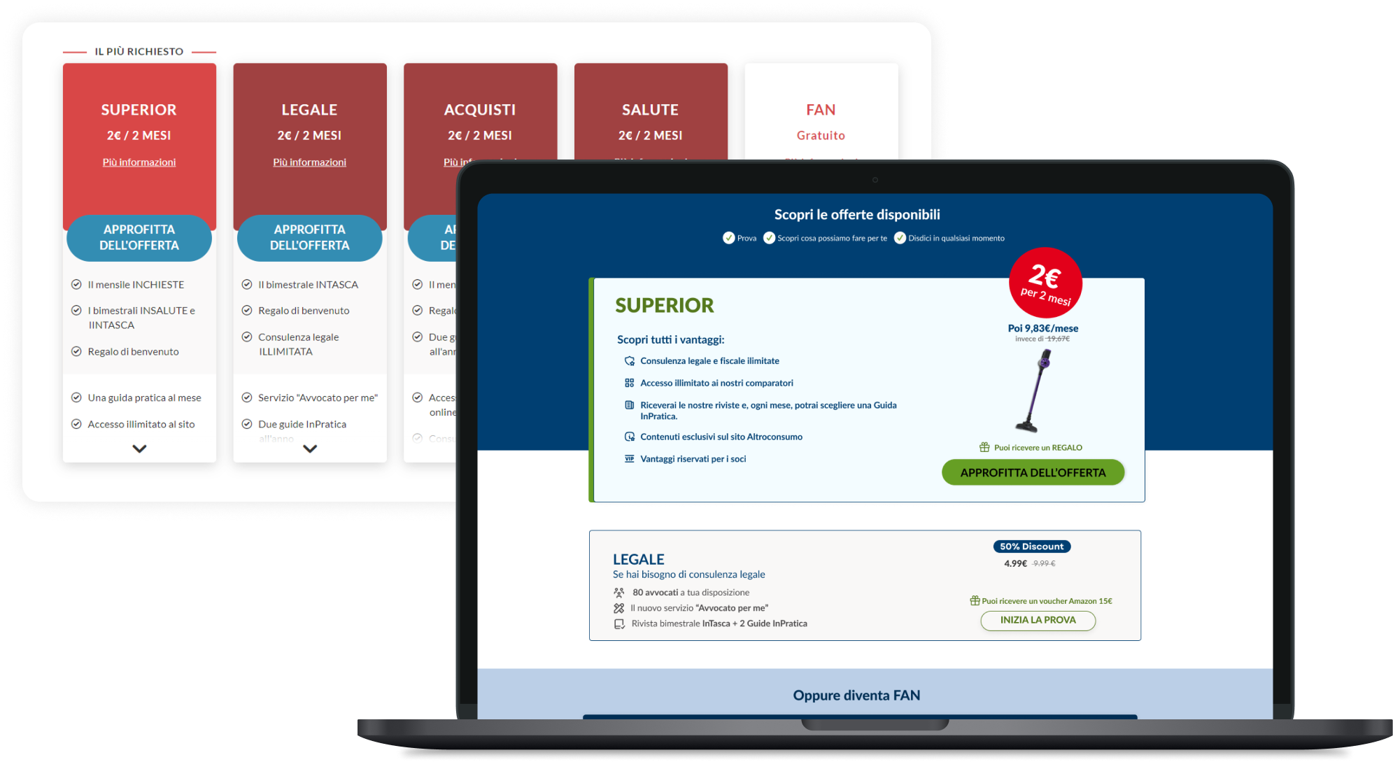
01 — The problem
Too many choices.
No clear decision.
Users weren’t confused.
They were overwhelmed by choice.
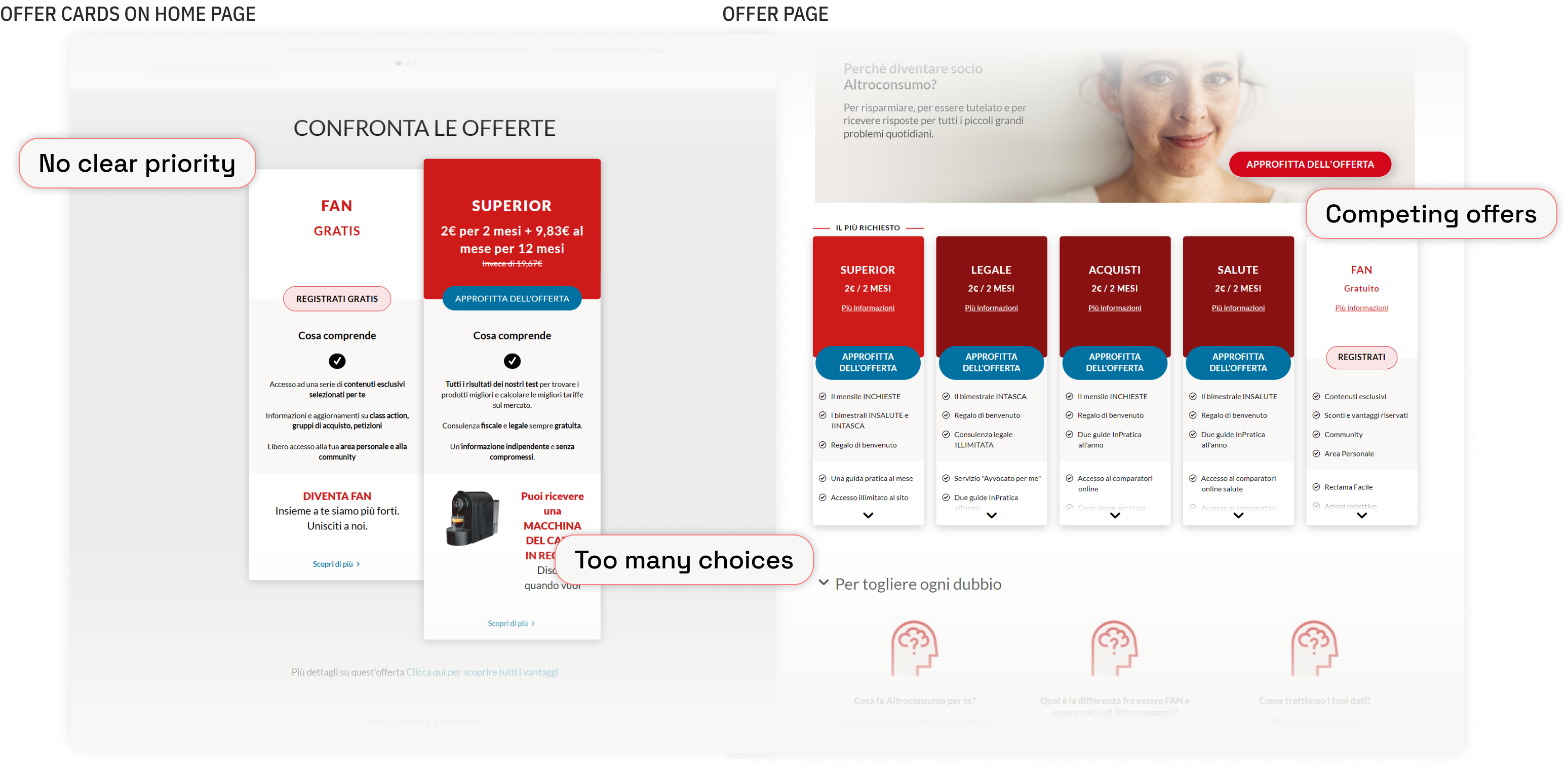
Across the experience, offers appeared in multiple forms —
from homepage cards to full offer pages.
Each one tried to stand out.
None of them actually led.
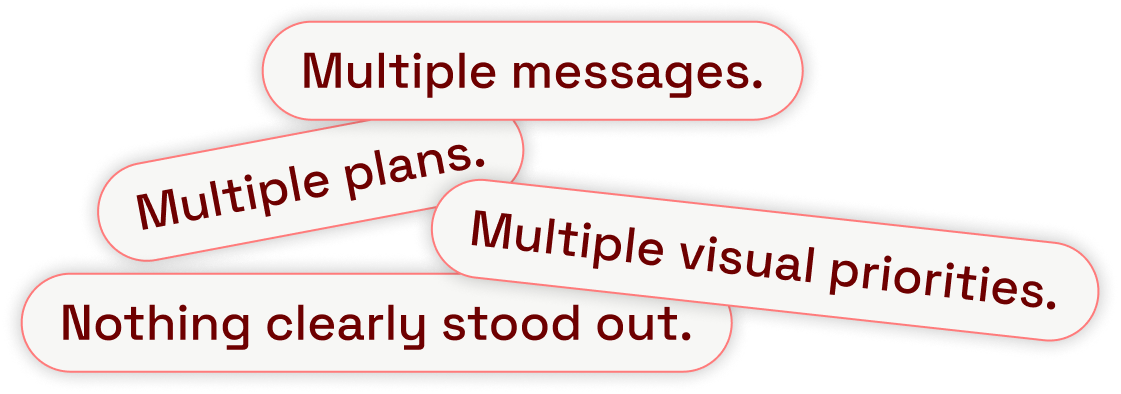
Users didn’t struggle to understand —
they struggled to decide.
02 — The shift
Starting from entry points
This wasn’t about redesigning offer pages.
It started earlier.
The first change happened on the homepage —
where offer cards compete for attention.
We reduced noise and introduced direction.
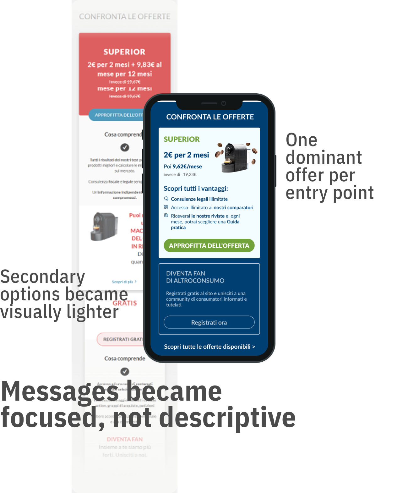
Instead of showing everything,
the interface started guiding choices.
03 — Scaling
From cards to system
The logic didn’t stay on the homepage.
It scaled.
The offer page became the clearest expression of the system.
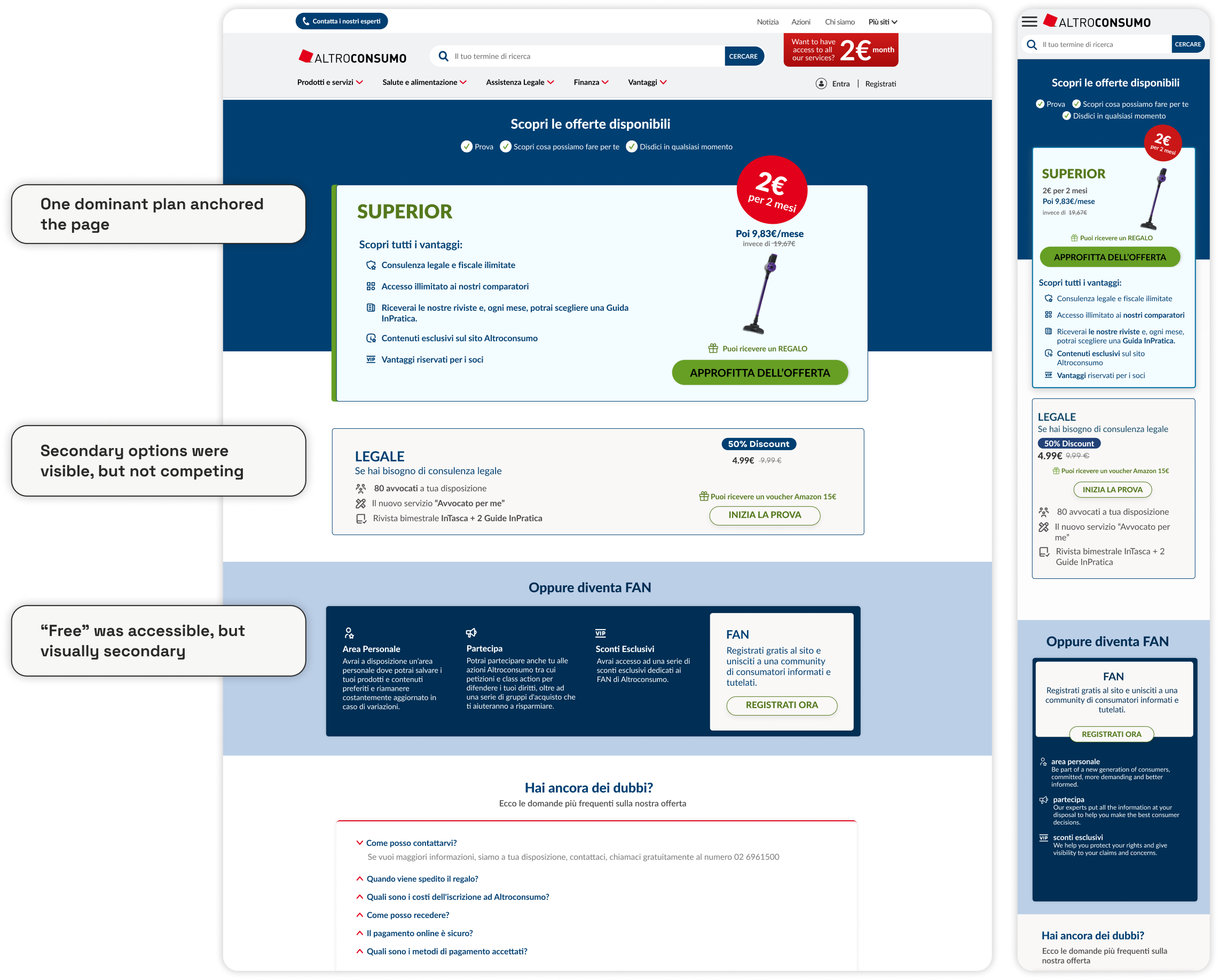
The layout didn’t present choices.
It structured them.
Users no longer had to compare everything.
They were guided to decide.
04 — System
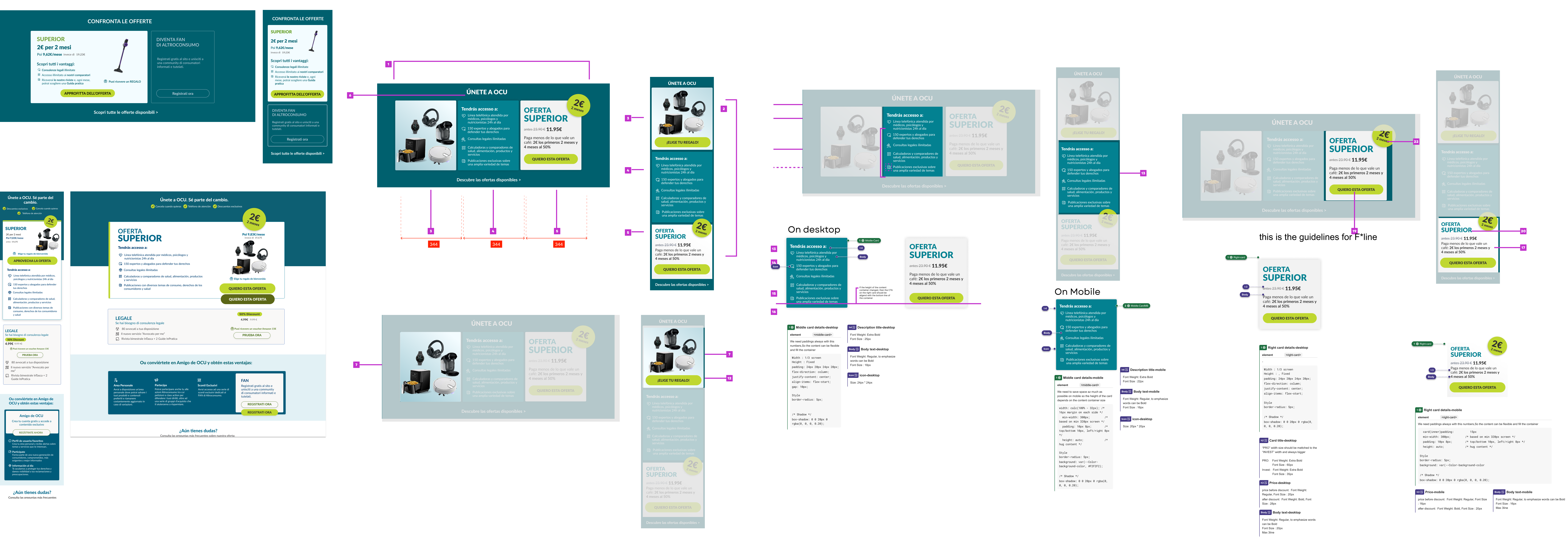
Scaling consistency
This wasn’t a one-off optimization.
It became a system.
The same logic was applied across markets,
without breaking consistency.
- A shared structure for all offer pages
- Reusable components for faster implementation
- Consistent hierarchy across different brands
Design and development followed the same rules.
The system reduced complexity —
for both users and teams.
05 — Impact
Measured outcome
But the real shift wasn’t in the numbers.
It was in behavior:
- users stopped hesitating
- comparison dropped
- decisions became faster
06 — Takeaway
Less choice. Better decisions.
More options don’t create more value.
They create more friction.
By reducing choice and controlling hierarchy,
we turned complexity into conversion.