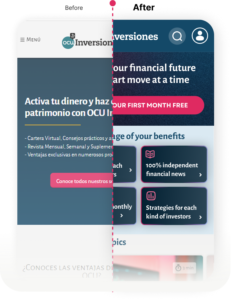
01 — The architectural challenge
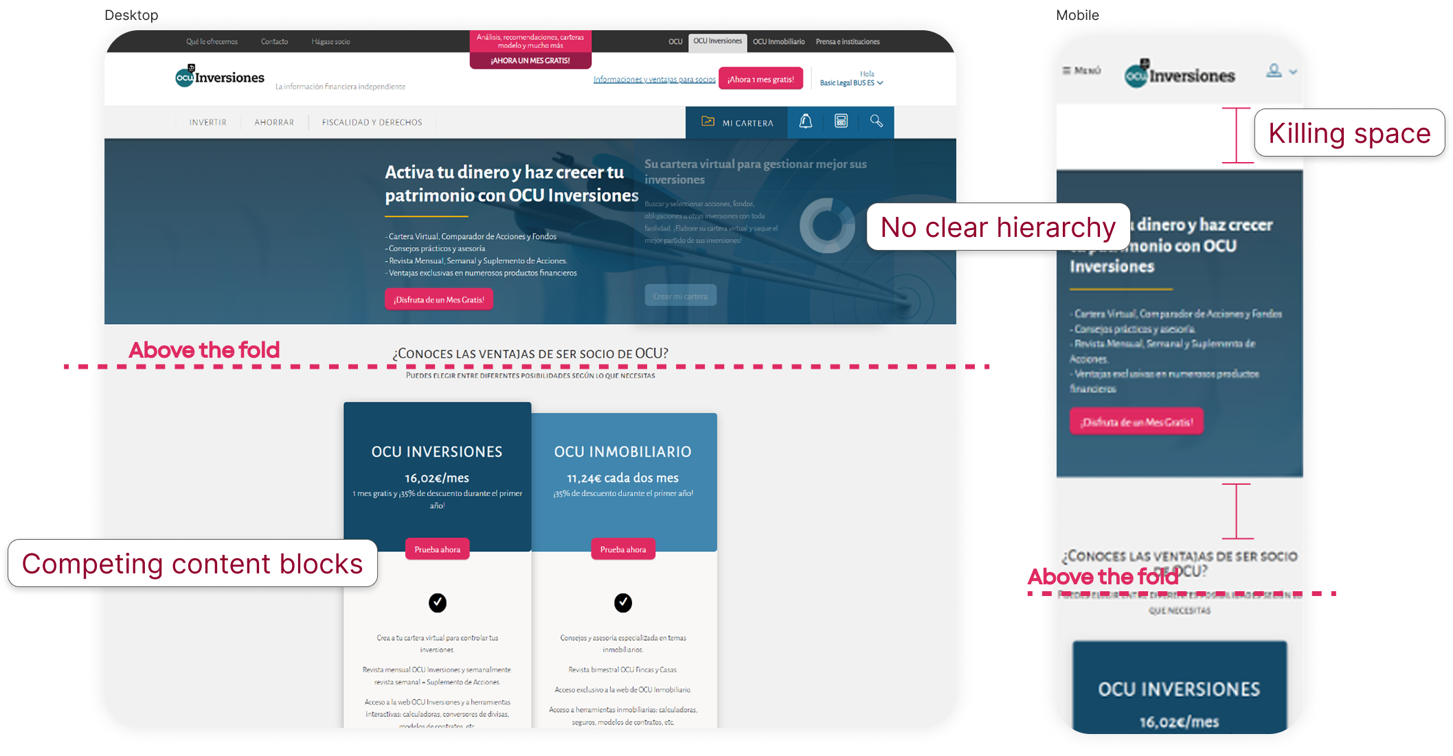
The problem
Traffic wasn't the problem.
Direction was.
F-line was bringing users in — consistently.
But once they landed, nothing pushed them forward.
Not because the content failed —
but because the structure didn't help them decide.
02 — The shift
Redesigning how users move
I didn't redesign pages.
I redesigned how users move.
The goal wasn't to "improve UI".
It was to control:

Everything else followed that.
03 — Navigation
Navigation as a guide
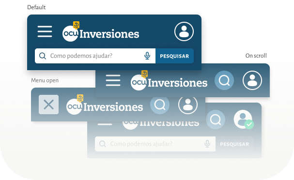
Navigation stopped being a list.
It became a guide.
- All key sections visible without scroll
- Search always accessible
- Conversion entry always present
No dead ends. No guesswork.
Every state had a next step.
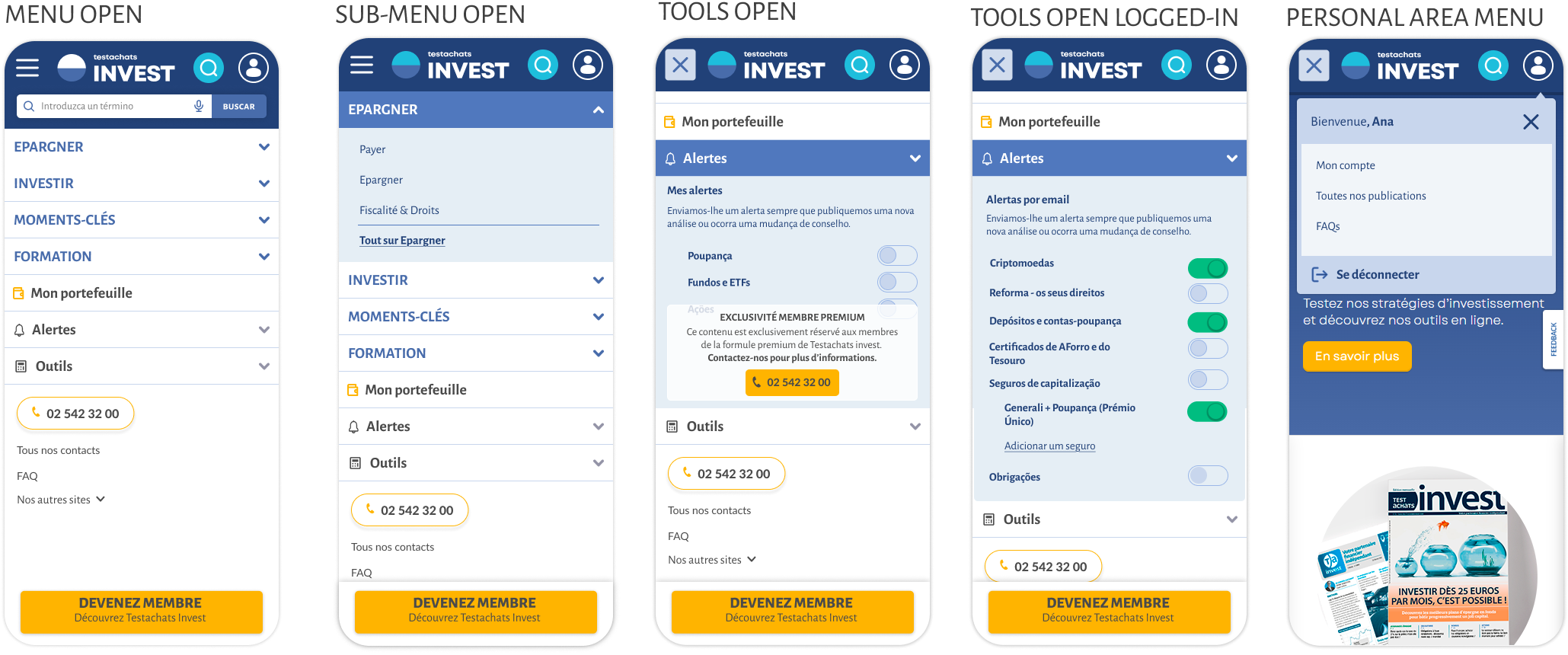
Example of Belgium branding country
04 — Structure & flow
From noise to direction
The interface stopped competing with itself.
- Primary actions were isolated and reinforced
- Secondary elements lost visual dominance
- Header behavior adapted to user scroll
The result:
less noise, clearer intent, faster decisions.
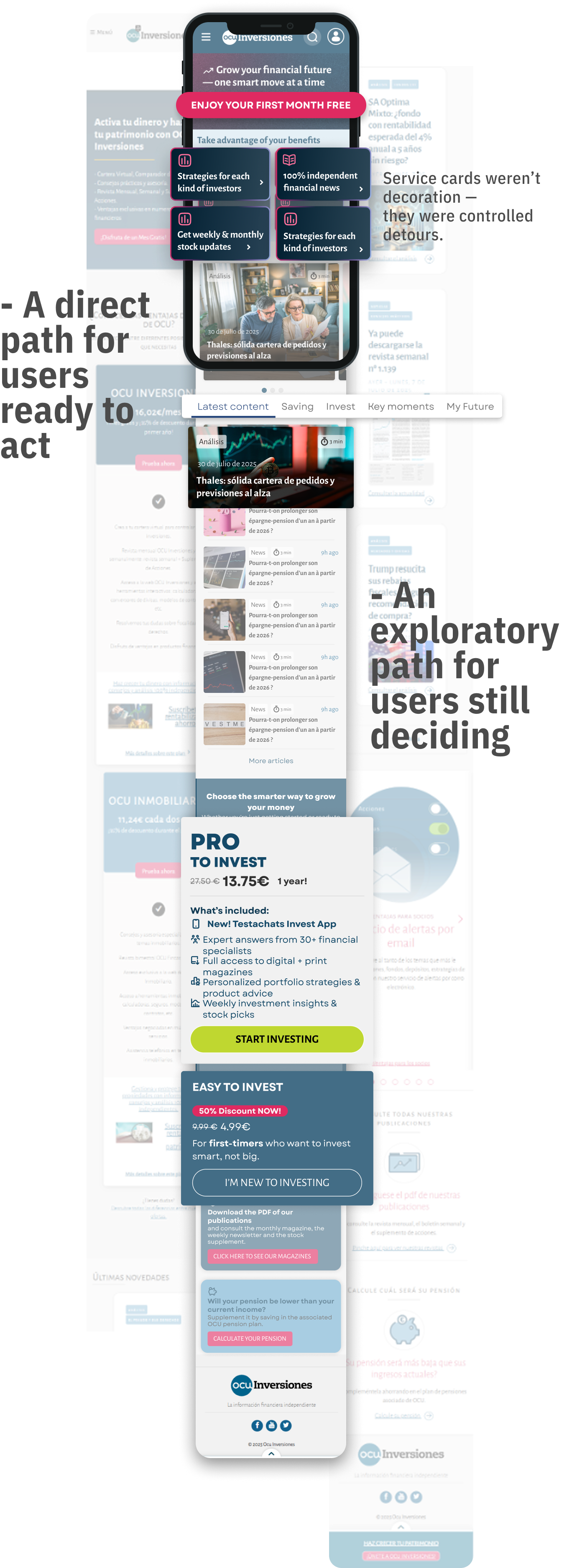
The homepage became a funnel.
Instead of dumping content, it created paths:
05 — Reading
Reducing friction
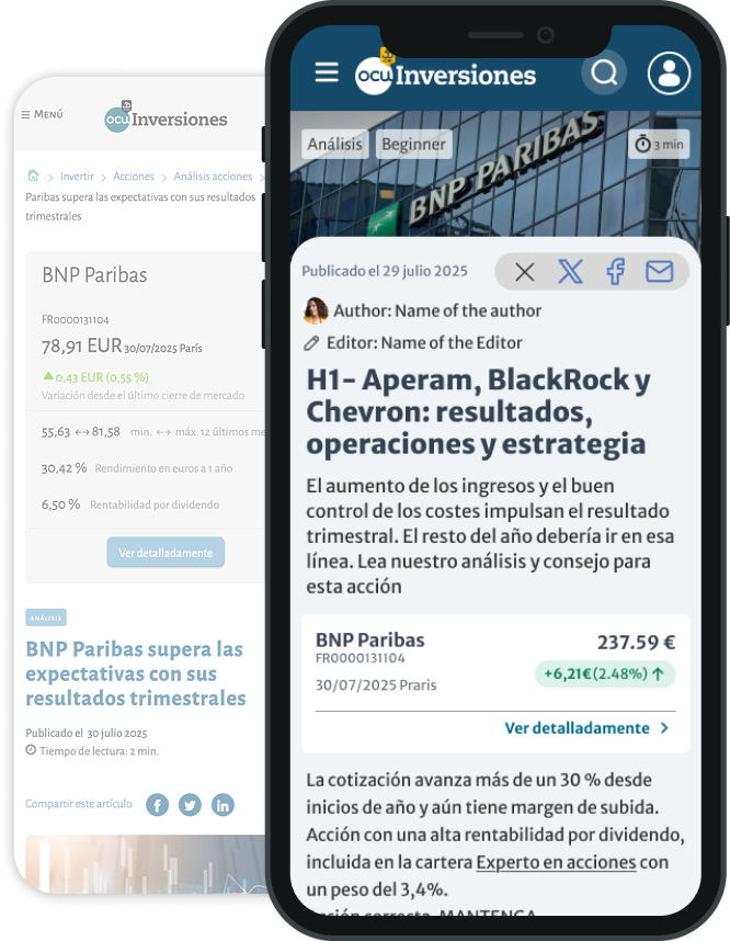
Reading became frictionless.
- Critical context moved above the fold
- Layout structured for continuous flow
- Visual interruptions reduced
Users didn't bounce —
they stayed and engaged.
06 — Impact
Measured shift
But the real shift wasn't in the numbers.
It was in behavior:
- users explored more
- hesitation dropped
- decisions happened faster
Takeaway
Clarity doesn't come from cleaner UI.
It comes from controlled structure.
When the system guides behavior, users don't need to think — they just act.